How To Create Alert Box Using Tailwind CSS
As web developers, we understand the importance of alert boxes in delivering essential information and notifications to users. They serve as a critical communication tool, guiding users through actions or notifying them about important updates. However, designing and styling alert boxes can often be a time-consuming task. Luckily, I've discovered a solution that makes the process much more efficient and enjoyable: Tailwind CSS.
Tailwind CSS, a utility-first CSS framework, offers a convenient and straightforward approach to creating stylish and customizable alert boxes for our web applications. With its extensive range of utility classes, we can easily apply styles, customize colors, and add interactive elements to our alert boxes without the need for complex CSS code.
In this article, I will guide you through the world of Tailwind CSS alert boxes. Together, we'll explore step-by-step instructions on how to create and customize alert boxes using Tailwind CSS. I'll provide you with code examples at each step to ensure a clear understanding. Whether you're a beginner or an experienced developer, this guide will help you enhance the user experience of your web applications with visually appealing and functional alert boxes.
By the end of this article, you'll have the knowledge and skills to create various types of alert boxes, such as informational alerts, success notifications, warning messages, and error notifications, all powered by the simplicity and flexibility of Tailwind CSS.
So, let's embark on this journey together and level up our alert box game with Tailwind CSS!
Creating Stylish Alert Boxes with Tailwind CSS:
Create a new HTML file and add the necessary boilerplate code, including the <html>, <head>, and <body> tags.
Option 1: Using CDN In the <head> section of your HTML file, include the following link to the Tailwind CSS CDN.
<link href="https://cdn.tailwindcss.com/2.2.19/tailwind.min.css" rel="stylesheet">
Option 2: Importing into your project If you have a local installation of Tailwind CSS, you can import it into your project using a bundler like webpack or by including the compiled CSS file in your HTML.
Inside the <body> section of your HTML file, create a container to hold the alert box. You can use a <div> element with appropriate classes to style it as an alert box.
<div class="alert-box bg-blue-100 border-l-4 border-blue-500 text-blue-900 px-4 py-3 rounded relative" role="alert">
  <!-- Alert box content goes here -->
</div>
Tailwind CSS provides utility classes to style the alert box. Apply the relevant classes to the container to customize its appearance.
<div class="alert-box bg-blue-100 border-l-4 border-blue-500 text-blue-900 px-4 py-3 rounded relative" role="alert">
  <!-- Alert box content goes here -->
</div>
Inside the alert box container, add the necessary content for the alert box, such as a title and a description.
<div class="alert-box bg-blue-100 border-l-4 border-blue-500 text-blue-900 px-4 py-3 rounded relative" role="alert">
  <strong class="font-bold">Info:</strong>
  <span class="block sm:inline">This is an informational alert box.</span>
</div>
You can further customize and style the alert box using additional Tailwind CSS utility classes. For example, you can adjust the colors, padding, margin, or add icons to the alert box.
To create different types of alert boxes (e.g., success, warning, error), repeat steps 3-6 with appropriate classes and content for each type.
Here's an example of creating a success alert box.
<div class="alert-box bg-green-100 border-l-4 border-green-500 text-green-900 px-4 py-3 rounded relative" role="alert">
  <strong class="font-bold">Success:</strong>
  <span class="block sm:inline">This is a success alert box.</span>
</div>
And here's an example of creating a warning alert box.
<div class="alert-box bg-yellow-100 border-l-4 border-yellow-500 text-yellow-900 px-4 py-3 rounded relative" role="alert">
  <strong class="font-bold">Warning:</strong>
  <span class="block sm:inline">This is a warning alert box.</span>
</div>
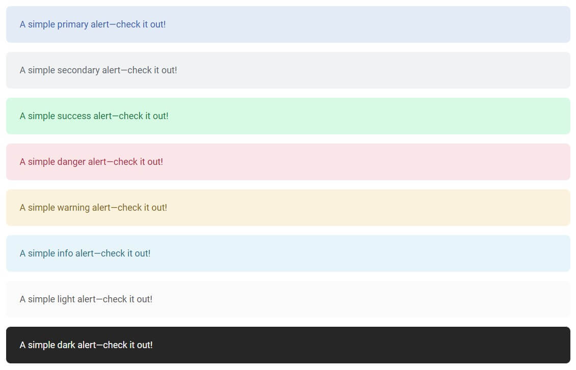
Basic alert box examples:
Alert offers different levels of severity that require immediate attention of the end users such as warning, error, or confirmation messages, which are determined by a distinctive color. Use one of the contextual classes below for a different look.
<div
  class="mb-4 rounded-lg bg-primary-100 px-6 py-5 text-base text-primary-600"
  role="alert">
  A simple primary alert—check it out!
</div>
<div
  class="mb-4 rounded-lg bg-secondary-100 px-6 py-5 text-base text-secondary-800"
  role="alert">
  A simple secondary alert—check it out!
</div>
<div
  class="mb-4 rounded-lg bg-success-100 px-6 py-5 text-base text-success-700"
  role="alert">
  A simple success alert—check it out!
</div>
<div
  class="mb-4 rounded-lg bg-danger-100 px-6 py-5 text-base text-danger-700"
  role="alert">
  A simple danger alert—check it out!
</div>
<div
  class="mb-4 rounded-lg bg-warning-100 px-6 py-5 text-base text-warning-800"
  role="alert">
  A simple warning alert—check it out!
</div>
<div
  class="mb-4 rounded-lg bg-info-100 px-6 py-5 text-base text-info-800"
  role="alert">
  A simple info alert—check it out!
</div>
<div
  class="mb-4 rounded-lg bg-neutral-50 px-6 py-5 text-base text-neutral-600"
  role="alert">
  A simple light alert—check it out!
</div>
<div
  class="mb-4 rounded-lg bg-neutral-800 px-6 py-5 text-base text-neutral-50 dark:bg-neutral-900"
  role="alert">
  A simple dark alert—check it out!
</div>
Output:
Alert box with Icon examples:
Include a descriptive icon to complement the message inside the alert component with the following example.
<div
  class="mb-3 inline-flex w-full items-center rounded-lg bg-primary-100 px-6 py-5 text-base text-primary-700"
  role="alert">
  <span class="mr-2">
    <svg
      xmlns="http://www.w3.org/2000/svg"
      viewBox="0 0 24 24"
      fill="currentColor"
      class="h-5 w-5">
      <path
        fill-rule="evenodd"
        d="M2.25 12c0-5.385 4.365-9.75 9.75-9.75s9.75 4.365 9.75 9.75-4.365 9.75-9.75 9.75S2.25 17.385 2.25 12zm8.706-1.442c1.146-.573 2.437.463 2.126 1.706l-.709 2.836.042-.02a.75.75 0 01.67 1.34l-.04.022c-1.147.573-2.438-.463-2.127-1.706l.71-2.836-.042.02a.75.75 0 11-.671-1.34l.041-.022zM12 9a.75.75 0 100-1.5.75.75 0 000 1.5z"
        clip-rule="evenodd" />
    </svg>
  </span>
  A simple primary alert - check it out!
</div>
<div
  class="mb-3 inline-flex w-full items-center rounded-lg bg-secondary-100 px-6 py-5 text-base text-secondary-800"
  role="alert">
  <span class="mr-2">
    <svg
      xmlns="http://www.w3.org/2000/svg"
      viewBox="0 0 24 24"
      fill="currentColor"
      class="h-5 w-5">
      <path
        fill-rule="evenodd"
        d="M12 2.25c-5.385 0-9.75 4.365-9.75 9.75s4.365 9.75 9.75 9.75 9.75-4.365 9.75-9.75S17.385 2.25 12 2.25zM12.75 9a.75.75 0 00-1.5 0v2.25H9a.75.75 0 000 1.5h2.25V15a.75.75 0 001.5 0v-2.25H15a.75.75 0 000-1.5h-2.25V9z"
        clip-rule="evenodd" />
    </svg>
  </span>
  A simple secondary alert - check it out!
</div>
<div
  class="mb-3 inline-flex w-full items-center rounded-lg bg-success-100 px-6 py-5 text-base text-success-700"
  role="alert">
  <span class="mr-2">
    <svg
      xmlns="http://www.w3.org/2000/svg"
      viewBox="0 0 24 24"
      fill="currentColor"
      class="h-5 w-5">
      <path
        fill-rule="evenodd"
        d="M2.25 12c0-5.385 4.365-9.75 9.75-9.75s9.75 4.365 9.75 9.75-4.365 9.75-9.75 9.75S2.25 17.385 2.25 12zm13.36-1.814a.75.75 0 10-1.22-.872l-3.236 4.53L9.53 12.22a.75.75 0 00-1.06 1.06l2.25 2.25a.75.75 0 001.14-.094l3.75-5.25z"
        clip-rule="evenodd" />
    </svg>
  </span>
  A simple success alert - check it out!
</div>
<div
  class="mb-3 inline-flex w-full items-center rounded-lg bg-danger-100 px-6 py-5 text-base text-danger-700"
  role="alert">
  <span class="mr-2">
    <svg
      xmlns="http://www.w3.org/2000/svg"
      viewBox="0 0 24 24"
      fill="currentColor"
      class="h-5 w-5">
      <path
        fill-rule="evenodd"
        d="M12 2.25c-5.385 0-9.75 4.365-9.75 9.75s4.365 9.75 9.75 9.75 9.75-4.365 9.75-9.75S17.385 2.25 12 2.25zm-1.72 6.97a.75.75 0 10-1.06 1.06L10.94 12l-1.72 1.72a.75.75 0 101.06 1.06L12 13.06l1.72 1.72a.75.75 0 101.06-1.06L13.06 12l1.72-1.72a.75.75 0 10-1.06-1.06L12 10.94l-1.72-1.72z"
        clip-rule="evenodd" />
    </svg>
  </span>
  A simple danger alert - check it out!
</div>
<div
  class="mb-3 inline-flex w-full items-center rounded-lg bg-warning-100 px-6 py-5 text-base text-warning-800"
  role="alert">
  <span class="mr-2">
    <svg
      xmlns="http://www.w3.org/2000/svg"
      viewBox="0 0 24 24"
      fill="currentColor"
      class="h-5 w-5">
      <path
        fill-rule="evenodd"
        d="M9.401 3.003c1.155-2 4.043-2 5.197 0l7.355 12.748c1.154 2-.29 4.5-2.599 4.5H4.645c-2.309 0-3.752-2.5-2.598-4.5L9.4 3.003zM12 8.25a.75.75 0 01.75.75v3.75a.75.75 0 01-1.5 0V9a.75.75 0 01.75-.75zm0 8.25a.75.75 0 100-1.5.75.75 0 000 1.5z"
        clip-rule="evenodd" />
    </svg>
  </span>
  A simple warning alert - check it out!
</div>
<div
  class="mb-3 inline-flex w-full items-center rounded-lg bg-info-100 px-6 py-5 text-base text-info-800"
  role="alert">
  <span class="mr-2">
    <svg
      xmlns="http://www.w3.org/2000/svg"
      viewBox="0 0 24 24"
      fill="currentColor"
      class="h-5 w-5">
      <path
        fill-rule="evenodd"
        d="M12 2.25c-5.385 0-9.75 4.365-9.75 9.75s4.365 9.75 9.75 9.75 9.75-4.365 9.75-9.75S17.385 2.25 12 2.25zm4.28 10.28a.75.75 0 000-1.06l-3-3a.75.75 0 10-1.06 1.06l1.72 1.72H8.25a.75.75 0 000 1.5h5.69l-1.72 1.72a.75.75 0 101.06 1.06l3-3z"
        clip-rule="evenodd" />
    </svg>
  </span>
  A simple indigo alert - check it out!
</div>
<div
  class="mb-3 inline-flex w-full items-center rounded-lg bg-neutral-50 px-6 py-5 text-base text-neutral-600"
  role="alert">
  <span class="mr-2">
    <svg
      xmlns="http://www.w3.org/2000/svg"
      viewBox="0 0 24 24"
      fill="currentColor"
      class="h-5 w-5">
      <path
        d="M8.25 10.875a2.625 2.625 0 115.25 0 2.625 2.625 0 01-5.25 0z" />
      <path
        fill-rule="evenodd"
        d="M12 2.25c-5.385 0-9.75 4.365-9.75 9.75s4.365 9.75 9.75 9.75 9.75-4.365 9.75-9.75S17.385 2.25 12 2.25zm-1.125 4.5a4.125 4.125 0 102.338 7.524l2.007 2.006a.75.75 0 101.06-1.06l-2.006-2.007a4.125 4.125 0 00-3.399-6.463z"
        clip-rule="evenodd" />
    </svg>
  </span>
  A simple light alert - check it out!
</div>
<div
  class="mb-3 inline-flex w-full items-center rounded-lg bg-neutral-800 px-6 py-5 text-base text-neutral-50 dark:bg-neutral-900"
  role="alert">
  <span class="mr-2">
    <svg
      xmlns="http://www.w3.org/2000/svg"
      viewBox="0 0 24 24"
      fill="currentColor"
      class="h-5 w-5">
      <path
        fill-rule="evenodd"
        d="M6.32 2.577a49.255 49.255 0 0111.36 0c1.497.174 2.57 1.46 2.57 2.93V21a.75.75 0 01-1.085.67L12 18.089l-7.165 3.583A.75.75 0 013.75 21V5.507c0-1.47 1.073-2.756 2.57-2.93z"
        clip-rule="evenodd" />
    </svg>
  </span>
  A simple dark alert - check it out!
</div>
Output:
Alert box with dismissing example:
To skip alerts that the user has already read, we can add an optional close button so the user can easily dismiss it.
<div
  class="mb-3 hidden w-full items-center rounded-lg bg-warning-100 px-6 py-5 text-base text-warning-800 data-[te-alert-show]:inline-flex"
  role="alert"
  data-te-alert-init
  data-te-alert-show>
  <strong class="mr-1">Holy guacamole! </strong> You should check in on
  some of those fields below.
  <button
    type="button"
    class="ml-auto box-content rounded-none border-none p-1 text-warning-900 opacity-50 hover:text-warning-900 hover:no-underline hover:opacity-75 focus:opacity-100 focus:shadow-none focus:outline-none"
    data-te-alert-dismiss
    aria-label="Close">
    <span
      class="w-[1em] focus:opacity-100 disabled:pointer-events-none disabled:select-none disabled:opacity-25 [&.disabled]:pointer-events-none [&.disabled]:select-none [&.disabled]:opacity-25">
      <svg
        xmlns="http://www.w3.org/2000/svg"
        viewBox="0 0 24 24"
        fill="currentColor"
        class="h-6 w-6">
        <path
          fill-rule="evenodd"
          d="M5.47 5.47a.75.75 0 011.06 0L12 10.94l5.47-5.47a.75.75 0 111.06 1.06L13.06 12l5.47 5.47a.75.75 0 11-1.06 1.06L12 13.06l-5.47 5.47a.75.75 0 01-1.06-1.06L10.94 12 5.47 6.53a.75.75 0 010-1.06z"
          clip-rule="evenodd" />
      </svg>
    </span>
  </button>
</div>
Javascript:
// Initialization for ES Users
import {
  Alert,
  initTE,
} from "tw-elements";

initTE({ Alert });
If you are looking for more advanced options, try Bootstrap Alerts from MDBootstrap.
You might also like:
- Read Also: How To Install Tailwind CSS In Laravel 10
- Read Also: How To Install Sweetalert2 In Laravel 9
- Read Also: How To Use Sweet Alert In Vue JS
- Read Also: Laravel 9 Dynamic Bar Chart Example


