How To Create Toast Notification Using Tailwind CSS
In today's fast-paced digital world, effective communication is key to keeping users engaged and informed. As a web developer, I understand the importance of delivering timely messages and alerts to website visitors in a non-intrusive yet attention-grabbing manner. That's why I have discovered the power of toast notifications.
Toast notifications have become increasingly popular in the web development community as a way to provide users with important updates and information. These notifications are brief messages that appear on the screen, delivering timely messages without disrupting the user's workflow. They are commonly used for notifying users about successful form submissions, error messages, new messages, or system updates.
When it comes to implementing toast notifications, I often face the challenge of finding a solution that is visually appealing and easy to integrate into my projects. Luckily, I have found a fantastic solution in Tailwind CSS.
Tailwind CSS is a utility-first CSS framework that offers a wide range of pre-built components and styles, making it an ideal choice for creating beautiful and functional toast notifications. With its flexible and customizable approach, I can effortlessly design toast notifications that seamlessly blend with the overall aesthetics of my web application.
In this article, I will guide you through the step-by-step process of creating toast notifications using Tailwind CSS. Together, we will explore how to set up the necessary HTML structure, leverage Tailwind CSS classes to style the notifications, and incorporate JavaScript functionality to control their behavior.
Whether you're a seasoned developer or just starting your coding journey, this tutorial will equip you with the knowledge and skills to implement toast notifications that enhance the user experience of your web application.
So, if you're ready to take your web development skills to the next level and elevate your user interface with elegant toast notifications, let's delve into the world of Tailwind CSS and discover the possibilities it holds for enhancing your web application's communication capabilities.
Here's a step-by-step guide on creating toast notifications using Tailwind CSS, along with a code example.
Start by creating the HTML structure that will hold the toast notification. Typically, this involves adding a container element and a notification element within it.
<div
  class="pointer-events-auto mx-auto hidden w-96 max-w-full rounded-lg bg-white bg-clip-padding text-sm shadow-lg shadow-black/5 data-[te-toast-show]:block data-[te-toast-hide]:hidden dark:bg-neutral-600"
  id="static-example"
  role="alert"
  aria-live="assertive"
  aria-atomic="true"
  data-te-autohide="false"
  data-te-toast-init
  data-te-toast-show>
  <div
    class="flex items-center justify-between rounded-t-lg border-b-2 border-neutral-100 border-opacity-100 bg-white bg-clip-padding px-4 pb-2 pt-2.5 dark:border-opacity-50 dark:bg-neutral-600">
    <p class="font-bold text-neutral-500 dark:text-neutral-200">
      MDBootstrap
    </p>
    <div class="flex items-center">
      <p class="text-xs text-neutral-600 dark:text-neutral-300">
        11 mins ago
      </p>
      <button
        type="button"
        class="ml-2 box-content rounded-none border-none opacity-80 hover:no-underline hover:opacity-75 focus:opacity-100 focus:shadow-none focus:outline-none"
        data-te-toast-dismiss
        aria-label="Close">
        <span
          class="w-[1em] focus:opacity-100 disabled:pointer-events-none disabled:select-none disabled:opacity-25 [&.disabled]:pointer-events-none [&.disabled]:select-none [&.disabled]:opacity-25">
          <svg
            xmlns="http://www.w3.org/2000/svg"
            fill="none"
            viewBox="0 0 24 24"
            stroke-width="1.5"
            stroke="currentColor"
            class="h-6 w-6">
            <path
              stroke-linecap="round"
              stroke-linejoin="round"
              d="M6 18L18 6M6 6l12 12" />
          </svg>
        </span>
      </button>
    </div>
  </div>
  <div
    class="break-words rounded-b-lg bg-white px-4 py-4 text-neutral-700 dark:bg-neutral-600 dark:text-neutral-200">
    Static Example
  </div>
</div>
Implement JavaScript to control the behavior of the toast notification.
// Initialization for ES Users
import {
  Toast,
  initTE,
} from "tw-elements";

initTE({ Toast });
There are several types of toast notifications that can be used in web applications to deliver important messages and alerts to users. Here are some common types:
-
Success Notifications: These toast notifications are used to communicate successful actions or operations. They provide users with positive feedback, such as a successful form submission, a completed transaction, or a task completed successfully.
-
Error Notifications: Error notifications are crucial for informing users about any errors or issues that occur during their interaction with the application. They help users identify and rectify problems, such as invalid input, network errors, or server-side errors.
-
Information Notifications: Information notifications deliver relevant information to users without requiring any specific action. They can be used to provide updates, reminders, or general information that users need to be aware of, such as upcoming events, system maintenance notices, or new feature announcements.
-
Warning Notifications: Warning notifications are used to alert users about potential issues or risks that they should be cautious about. They indicate situations that require attention, such as incomplete form fields, expiring subscriptions, or actions that may have unintended consequences.
-
Confirmation Notifications: These notifications are used to prompt users for confirmation before proceeding with a specific action. They ask users to confirm their choices or decisions before executing an irreversible action, such as deleting data or unsubscribing from a service.
-
Progress Notifications: Progress notifications provide feedback to users about the status of a process or operation that takes some time to complete. They indicate that the application is working on a task and keep users informed and engaged during the waiting period.
-
Dismissable Notifications: Dismissable notifications allow users to manually close or dismiss the toast notification if they no longer need to view the message. This feature gives users control over the notifications and improves the overall user experience.
These different types of toast notifications can be customized in terms of their appearance, duration, position on the screen, and interaction behavior to best suit the specific needs of your web application and the messages you want to convey to your users.
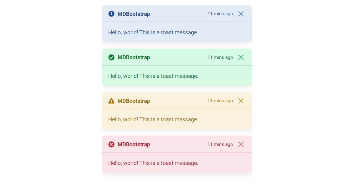
Type of Colors Example:
Enhance your user experience by utilizing these user-friendly contextual toast components. With just a few simple steps, you can display primary, success, danger, or warning alert messages that effectively communicate important information to your users.
Add HTML code structure. Typically, this involves multiple elements and notification elements within it.
<div
  class="pointer-events-auto mx-auto mb-4 hidden w-96 max-w-full rounded-lg bg-primary-100 bg-clip-padding text-sm text-primary-700 shadow-lg shadow-black/5 data-[te-toast-show]:block data-[te-toast-hide]:hidden"
  id="static-example"
  role="alert"
  aria-live="assertive"
  aria-atomic="true"
  data-te-autohide="false"
  data-te-toast-init
  data-te-toast-show>
  <div
    class="flex items-center justify-between rounded-t-lg border-b-2 border-primary-200 bg-primary-100 bg-clip-padding px-4 pb-2 pt-2.5 text-primary-700">
    <p class="flex items-center font-bold text-primary-700">
      <svg
        aria-hidden="true"
        focusable="false"
        data-prefix="fas"
        data-icon="info-circle"
        class="mr-2 h-4 w-4 fill-current"
        role="img"
        xmlns="http://www.w3.org/2000/svg"
        viewBox="0 0 512 512">
        <path
          fill="currentColor"
          d="M256 8C119.043 8 8 119.083 8 256c0 136.997 111.043 248 248 248s248-111.003 248-248C504 119.083 392.957 8 256 8zm0 110c23.196 0 42 18.804 42 42s-18.804 42-42 42-42-18.804-42-42 18.804-42 42-42zm56 254c0 6.627-5.373 12-12 12h-88c-6.627 0-12-5.373-12-12v-24c0-6.627 5.373-12 12-12h12v-64h-12c-6.627 0-12-5.373-12-12v-24c0-6.627 5.373-12 12-12h64c6.627 0 12 5.373 12 12v100h12c6.627 0 12 5.373 12 12v24z"></path>
      </svg>
      MDBootstrap
    </p>
    <div class="flex items-center">
      <p class="text-xs text-primary-700">11 mins ago</p>
      <button
        type="button"
        class="ml-2 box-content rounded-none border-none opacity-80 hover:no-underline hover:opacity-75 focus:opacity-100 focus:shadow-none focus:outline-none"
        data-te-toast-dismiss
        aria-label="Close">
        <span
          class="w-[1em] focus:opacity-100 disabled:pointer-events-none disabled:select-none disabled:opacity-25 [&.disabled]:pointer-events-none [&.disabled]:select-none [&.disabled]:opacity-25">
          <svg
            xmlns="http://www.w3.org/2000/svg"
            fill="none"
            viewBox="0 0 24 24"
            stroke-width="1.5"
            stroke="currentColor"
            class="h-6 w-6">
            <path
              stroke-linecap="round"
              stroke-linejoin="round"
              d="M6 18L18 6M6 6l12 12" />
          </svg>
        </span>
      </button>
    </div>
  </div>
  <div
    class="break-words rounded-b-lg bg-primary-100 px-4 py-4 text-primary-700">
    Hello, world! This is a toast message.
  </div>
</div>
<div
  class="pointer-events-auto mx-auto mb-4 hidden w-96 max-w-full rounded-lg bg-success-100 bg-clip-padding text-sm text-success-700 shadow-lg shadow-black/5 data-[te-toast-show]:block data-[te-toast-hide]:hidden"
  id="static-example"
  role="alert"
  aria-live="assertive"
  aria-atomic="true"
  data-te-autohide="false"
  data-te-toast-init
  data-te-toast-show>
  <div
    class="flex items-center justify-between rounded-t-lg border-b-2 border-success/20 bg-success-100 bg-clip-padding px-4 pb-2 pt-2.5">
    <p class="flex items-center font-bold text-success-700">
      <svg
        aria-hidden="true"
        focusable="false"
        data-prefix="fas"
        data-icon="check-circle"
        class="mr-2 h-4 w-4 fill-current"
        role="img"
        xmlns="http://www.w3.org/2000/svg"
        viewBox="0 0 512 512">
        <path
          fill="currentColor"
          d="M504 256c0 136.967-111.033 248-248 248S8 392.967 8 256 119.033 8 256 8s248 111.033 248 248zM227.314 387.314l184-184c6.248-6.248 6.248-16.379 0-22.627l-22.627-22.627c-6.248-6.249-16.379-6.249-22.628 0L216 308.118l-70.059-70.059c-6.248-6.248-16.379-6.248-22.628 0l-22.627 22.627c-6.248 6.248-6.248 16.379 0 22.627l104 104c6.249 6.249 16.379 6.249 22.628.001z"></path>
      </svg>
      MDBootstrap
    </p>
    <div class="flex items-center">
      <p class="text-xs text-success-700">11 mins ago</p>
      <button
        type="button"
        class="ml-2 box-content rounded-none border-none opacity-80 hover:no-underline hover:opacity-75 focus:opacity-100 focus:shadow-none focus:outline-none"
        data-te-toast-dismiss
        aria-label="Close">
        <span
          class="w-[1em] focus:opacity-100 disabled:pointer-events-none disabled:select-none disabled:opacity-25 [&.disabled]:pointer-events-none [&.disabled]:select-none [&.disabled]:opacity-25">
          <svg
            xmlns="http://www.w3.org/2000/svg"
            fill="none"
            viewBox="0 0 24 24"
            stroke-width="1.5"
            stroke="currentColor"
            class="h-6 w-6">
            <path
              stroke-linecap="round"
              stroke-linejoin="round"
              d="M6 18L18 6M6 6l12 12" />
          </svg>
        </span>
      </button>
    </div>
  </div>
  <div
    class="break-words rounded-b-lg bg-success-100 px-4 py-4 text-success-700">
    Hello, world! This is a toast message.
  </div>
</div>
<div
  class="pointer-events-auto mx-auto mb-4 hidden w-96 max-w-full rounded-lg bg-warning-100 bg-clip-padding text-sm text-warning-700 shadow-lg shadow-black/5 data-[te-toast-show]:block data-[te-toast-hide]:hidden"
  id="static-example"
  role="alert"
  aria-live="assertive"
  aria-atomic="true"
  data-te-autohide="false"
  data-te-toast-init
  data-te-toast-show>
  <div
    class="flex items-center justify-between rounded-t-lg border-b-2 border-warning-200 bg-warning-100 bg-clip-padding px-4 pb-2 pt-2.5 text-warning-700">
    <p class="flex items-center font-bold text-warning-700">
      <svg
        aria-hidden="true"
        focusable="false"
        data-prefix="fas"
        data-icon="exclamation-triangle"
        class="mr-2 h-4 w-4 fill-current"
        role="img"
        xmlns="http://www.w3.org/2000/svg"
        viewBox="0 0 576 512">
        <path
          fill="currentColor"
          d="M569.517 440.013C587.975 472.007 564.806 512 527.94 512H48.054c-36.937 0-59.999-40.055-41.577-71.987L246.423 23.985c18.467-32.009 64.72-31.951 83.154 0l239.94 416.028zM288 354c-25.405 0-46 20.595-46 46s20.595 46 46 46 46-20.595 46-46-20.595-46-46-46zm-43.673-165.346l7.418 136c.347 6.364 5.609 11.346 11.982 11.346h48.546c6.373 0 11.635-4.982 11.982-11.346l7.418-136c.375-6.874-5.098-12.654-11.982-12.654h-63.383c-6.884 0-12.356 5.78-11.981 12.654z"></path>
      </svg>
      MDBootstrap
    </p>
    <div class="flex items-center">
      <p class="text-xs text-warning-700 opacity-90">11 mins ago</p>
      <button
        type="button"
        class="ml-2 box-content rounded-none border-none opacity-80 hover:no-underline hover:opacity-75 focus:opacity-100 focus:shadow-none focus:outline-none"
        data-te-toast-dismiss
        aria-label="Close">
        <span
          class="w-[1em] focus:opacity-100 disabled:pointer-events-none disabled:select-none disabled:opacity-25 [&.disabled]:pointer-events-none [&.disabled]:select-none [&.disabled]:opacity-25">
          <svg
            xmlns="http://www.w3.org/2000/svg"
            fill="none"
            viewBox="0 0 24 24"
            stroke-width="1.5"
            stroke="currentColor"
            class="h-6 w-6">
            <path
              stroke-linecap="round"
              stroke-linejoin="round"
              d="M6 18L18 6M6 6l12 12" />
          </svg>
        </span>
      </button>
    </div>
  </div>
  <div
    class="break-words rounded-b-lg bg-warning-100 px-4 py-4 text-warning-700">
    Hello, world! This is a toast message.
  </div>
</div>
<div
  class="pointer-events-auto mx-auto mb-4 hidden w-96 max-w-full rounded-lg bg-danger-100 bg-clip-padding text-sm text-danger-700 shadow-lg shadow-black/5 data-[te-toast-show]:block data-[te-toast-hide]:hidden"
  id="static-example"
  role="alert"
  aria-live="assertive"
  aria-atomic="true"
  data-te-autohide="false"
  data-te-toast-init
  data-te-toast-show>
  <div
    class="flex items-center justify-between rounded-t-lg border-b-2 border-danger-200 bg-danger-100 bg-clip-padding px-4 pb-2 pt-2.5 text-danger-700">
    <p class="flex items-center font-bold text-danger-700">
      <svg
        aria-hidden="true"
        focusable="false"
        data-prefix="fas"
        data-icon="times-circle"
        class="mr-2 h-4 w-4 fill-current"
        role="img"
        xmlns="http://www.w3.org/2000/svg"
        viewBox="0 0 512 512">
        <path
          fill="currentColor"
          d="M256 8C119 8 8 119 8 256s111 248 248 248 248-111 248-248S393 8 256 8zm121.6 313.1c4.7 4.7 4.7 12.3 0 17L338 377.6c-4.7 4.7-12.3 4.7-17 0L256 312l-65.1 65.6c-4.7 4.7-12.3 4.7-17 0L134.4 338c-4.7-4.7-4.7-12.3 0-17l65.6-65-65.6-65.1c-4.7-4.7-4.7-12.3 0-17l39.6-39.6c4.7-4.7 12.3-4.7 17 0l65 65.7 65.1-65.6c4.7-4.7 12.3-4.7 17 0l39.6 39.6c4.7 4.7 4.7 12.3 0 17L312 256l65.6 65.1z"></path>
      </svg>
      MDBootstrap
    </p>
    <div class="flex items-center">
      <p class="text-xs text-danger-700">11 mins ago</p>
      <button
        type="button"
        class="ml-2 box-content rounded-none border-none opacity-80 hover:no-underline hover:opacity-75 focus:opacity-100 focus:shadow-none focus:outline-none"
        data-te-toast-dismiss
        aria-label="Close">
        <span
          class="w-[1em] focus:opacity-100 disabled:pointer-events-none disabled:select-none disabled:opacity-25 [&.disabled]:pointer-events-none [&.disabled]:select-none [&.disabled]:opacity-25">
          <svg
            xmlns="http://www.w3.org/2000/svg"
            fill="none"
            viewBox="0 0 24 24"
            stroke-width="1.5"
            stroke="currentColor"
            class="h-6 w-6">
            <path
              stroke-linecap="round"
              stroke-linejoin="round"
              d="M6 18L18 6M6 6l12 12" />
          </svg>
        </span>
      </button>
    </div>
  </div>
  <div
    class="break-words rounded-b-lg bg-danger-100 px-4 py-4 text-danger-700">
    Hello, world! This is a toast message.
  </div>
</div>
Implement JavaScript to control the behavior of the toast notification.
// Initialization for ES Users
import {
  Toast,
  initTE,
} from "tw-elements";

initTE({ Toast });
In this article, we have explored the process of creating toast notifications using the power of Tailwind CSS. By following the step-by-step guide and leveraging the flexibility of Tailwind CSS classes, you can now effortlessly integrate visually appealing and functional toast notifications into your web application.
If you are looking for more advanced options, try Bootstrap Toasts from MDBootstrap.
You might also like:
- Read Also: How To Create Modal Popup Using Tailwind CSS
- Read Also: How To Use Toastr Notification In Laravel 9
- Read Also: Laravel 8 Paypal Payment Gateway Integration
- Read Also: Laravel 9 Dynamic Line Chart Example


